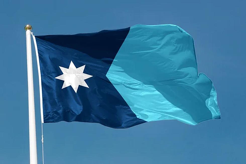
Minnesotans Respond To The States New Flag
Everyone has things that belong to them that they hold dear. Usually, it’s something that was handed down in their family or maybe something they found that was rare.

Or maybe it’s their states flag. Wait, what? Who knew the State Flag meant so much, but apparently it does. Yesterday I asked our listeners on our mobile app and on Facebook their thoughts on the newly designed Minnesota state flag.
The reaction was overwhelmingly negative.
From the simple responses:
Jennifer said, “Nope no thank you”, and Aaron added “The old one is just fine!”.
One of our respondents named Sarah replied, “I think the old one was nicer” while another Sarah said, “My thoughts are it’s crap, we should have never changed it!”.
Then we had some other listeners who felt more strongly, Naomi said “It has nothing to do with MN” . Kim said” They should have used the new state seal for the new flag. It’s more representative of Minnesota.” Holly answered” VERY bland. Not my personal preference. Nothing to take pride in or represent our state….however, nothing that should be offensive either. So maybe this has hit the PC goal??
I agree with the idea about the state seal at least have a smidge of MN on there. I know they said it’s the shape of the state, but at first glance it looks like a big K to me”
There were those who were thinking of the taxpayers in Minnesota, like Steve “Keep the current flag. Big waste of taxpayers' money”. Cindy also was thinking about tax dollars when she said “Don't like it. Doesn't represent MN. I feel it was a big waste of money and time. Now extra money will be spent on changing all the flags at state buildings, printing cost, logos, labor, ect. Where is all the money coming from to pay for this?”
Others seemed to not be aware that this was happening. LeAnn said "Definitely don’t like it and totally disagree with changing our State flag. Keep our State flag just the way it is We should be able to have a say in it"
Diann added this: “Do not like the change. The People of MN were not allowed a choice!”
Kristin chimed in with “Why change a good thing!! So sad”. Marise said “Don’t like it, wasn’t nothing wrong with the old flag!!” Kay added “Don’t like it. Why did we have to switch?”
Deborah “Not impressed - would have preferred to update to represent on both the flag and our seal. Has anyone asked the Native Americans for input on the statement regarding it being offensive? Or was that an assumption? To busy, par it down, but don’t dismiss the state seal on the flag, that is what made us unique in our flag. So many options and instead a lot of money wasted for a “expert” to say eventually they will love it “
There were others who felt that this change had a lot to do with politics. Jessica commented that “Looks like a foreign country flag, not one belonging to a state in the USA”. Brad added “Kind of resembles a Somalia state flag from what I’ve seen. Will we be changing the name of Minneapolis as well?”
Mark’s thoughts were these: “Can’t they just incorporate a communist China symbol in as well. Otherwise, it’s got to be the ugliest piece of crap I’ve ever seen!”
And there were others who chose to let emojis or gifs do the talking for them.
Debora:

Mary:
: 
Rene:

Kim:

Change is hard for people for sure, and this was another example of that. I’m glad so many people took the chance to at least let their voice be heard.
Minnesota's Ten Tallest Buildings
More From 96.7 The River


